How the Right Words Double Conversion Rate: CTA Copywriting
DIGITAL MARKETINGCONTENT MARKETINGE-COMMERCE
Table of Contents
Why CTA copy is the most underrated conversion variable
The anatomy of high-converting CTA copy
The 5 most powerful CTA copywriting formulas with examples
Words that don't help conversions and what to use instead
How to match your CTA copy to the funnel stage
Testing your CTA copy: What to measure and why it matters
Conclusion
References
Picture two identical web pages: same layout, same hero image, same offer. One converts at 2.1% and the other at 4.8%.
The only difference?
The four words on the button.
Most marketers pour hours into ad targeting, page design, and campaign budgets, then write the CTA copy in 10 seconds and never look at it again. That single button, that short phrase, is often the last psychological barrier between a visitor and a conversion. And yet it's the most overlooked element on the page.
This article breaks down the exact copywriting principles behind CTAs that consistently convert with practical formulas, real-world examples, and the silent mistakes that are draining your click-through rate right now.
1. Why CTA Copy is the most underrated conversion variable
Design earns attention, copy closes the action.
These two jobs are not interchangeable, and confusing them is one of the most expensive mistakes in conversion optimization.
When marketers run A/B tests on CTA elements, they almost always start with the obvious visual variables: button color, size, or placement. These matter, but time and again, copy changes, a single word swap, a shift from second to first person, or a more specific benefit, produce larger and more consistent lifts than design tweaks alone.
The reason is psychological: a button is a threshold. The moment a visitor reads your CTA, they make a micro-decision: is what happens next worth the effort of clicking? Design tells them where to look, but copy tells them why clicking is worth it. If the words don't answer 'what's in it for me?' clearly and immediately, the design is irrelevant.
This is why building a deliberate CTA strategy is so critical, because copy without strategic intent is just guesswork disguised in a button.
2. The anatomy of high-converting CTA copy
Before you rewrite a single button, understand what makes CTA copy structurally effective.
Here are the four components high-converting CTA copy consistently shares:
The most important insight here: generic CTAs like 'Click Here'or 'Submit' describe the user's action.
High-converting copy describes what happens after the click, the outcome, the reward, the result.
Compare these two:
❌ 'Download'
with
✅ 'Get My Free E-commerce Marketing Guide'
Same destination, but completely different psychological effect. The second version signals ownership, value, and zero friction, all in five words.
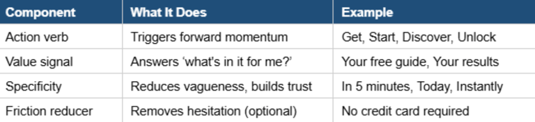
So, high-converting CTAs are not written by instinct, they are built from specific, repeatable components that work together to reduce friction, communicate value, and trigger action. Before you rewrite a single button, it helps to understand what those components are and what each one does.
The first and most important element is the action verb. It sets the tone, pace, and perceived effort of the entire interaction. Not all verbs carry equal weight.
Words like Unlock, Discover, and Start create a sense of forward motion and possibility. Words like Submit, Send, or Enter describe a mechanical task the user performs for the benefit of the business, not themselves.
The rule is simple: choose a verb that feels like the beginning of something good, not the completion of a form.
The second component is the value signal, the part of the copy that answers the question every visitor is silently asking: What do I actually get? This is where most CTAs fail. A button that says Download tells the user nothing about the value waiting on the other side of the click.
A button that says Get My Free Social Media Strategy Guide tells them exactly what they receive, that it costs nothing, and that it belongs to them. Value signals work best when they are outcome-based rather than feature-based.
Instead of describing the tool, describe the result it produces.
The third component is specificity. Vague CTAs feel risky because the brain cannot evaluate an unclear offer. Specific CTAs feel safe because they remove ambiguity. Adding a time reference like Get Instant Access, Ready in 2 Minutes or a quantity like 20-Page Guide, Over 200 Course Hours, makes the offer feel concrete and real.
Even a single specific word added to a generic CTA can meaningfully improve click-through rate. Download becomes Download the Free PDF. Sign Up becomes Sign Up in 30 Seconds.
The destination is identical, but the perceived risk is not.
The fourth component is the friction reducer, the short line of microcopy placed directly beneath the button that silences the last remaining doubt before the click.
Friction reducers address three common fears: cost (No credit card required, 100% free), privacy (We never share your data, No spam, ever), and effort (Cancel anytime, Takes less than 60 seconds). They are optional but often decisive, especially for high-commitment actions. Think of them as the whisper that turns hesitation into confidence.
These four components, action verb, value signal, specificity, and friction reducer, do not all need to appear on the button itself. The button carries the verb and value signal. The specificity can live in the surrounding copy. The friction reducer belongs beneath the button.
Together, they create a complete conversion environment, not just a better button.
3. The 5 most powerful CTA Copywriting Formulas with examples
Formulas are not shortcuts, they are distilled patterns from what consistently works.
Here are five formulas you can apply immediately:
a) Formula 1: The Outcome Formula
[Action Verb] + [Specific Result]
Best for: landing pages, lead magnets, product pages. This formula works because it shifts the focus from the click itself to the result of the click. The user's brain skips past the action and visualizes the reward.
Start Growing Your Email List Today
Get Your First 100 Leads This Month
Reduce Cart Abandonment in 7 Days
b) Formula 2: The Ownership Formula
[Action Verb] + 'My/Your' + [Object]
Best for: buttons where personalization is possible. First-person CTAs create a sense of personal relevance and possession before the click even happens. In some A/B tests, switching from 'Your' to 'My' has produced click-through rate improvements of up to 90%.
Get My Free Copy (vs. Download the Ebook)
Start My Free Trial (vs. Start Free Trial)
Create My Results-Driven Social Media Calendar
c) Formula 3: The Urgency + Benefit Formula
[Time Signal] + [Action Verb] + [Value]
Best for: promotional campaigns, limited offers, event registrations. Urgency accelerates decision-making but only when it's paired with a clear benefit. Urgency without value creates anxiety and urgency with value creates momentum.
Today Only: Get the Full CTA Playbook
Last Chance to Save 30% — Grab Your Copy
Register Now - Only 12 Spots Left
d) Formula 4: The Curiosity Formula
[Tease] + [Action Verb]
Best for: blog CTAs, email campaigns, top-of-funnel social media posts. Curiosity is one of the most reliable triggers in human psychology. When the CTA implies there is something valuable just beyond the click, without revealing exactly what, the friction of clicking drops significantly.
See What's Inside the CTA Strategies Ebook
Find Out Why Your CTAs Aren't Converting
Discover What Top Brands Do Differently
e) Formula 5: The Social Proof Formula
[Number or Authority Signal] + [Action Verb]
Best for: high-trust contexts, SaaS products, professional services. Social proof in the CTA itself, rather than only in testimonials around it, is an underused tactic that reduces risk perception at the exact moment of decision.
Join 50,000+ Marketers Who Upgraded Their CTAs
Used by Top Brands. Start Free Today
Download the Guide 10,000+ Marketers Trust
4. Words that don't help conversions and what to use instead
Some words feel safe, professional, and neutral and that is precisely why they fail. Neutral copy does not move people, it blends into the page and gets ignored.
The table below shows the most common underperforming CTA terms alongside stronger alternatives, and explains why the swap works.
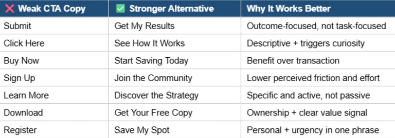
The most common category of weak CTA words are those that describe what the user does for the business, not what the business gives to the user. And Submit is the clearest example. When a visitor reads Submit, their brain registers a task performed in service of a form (data going somewhere), with no visible return.
Replacing it with Get My Results flips the equation entirely. The action becomes an exchange, not a chore. The same logic applies to Send, Register, and Enter, all of them describe the user's effort without hinting at any reward.
A second category of underperforming words are those that are ambiguous about what happens next. Learn More and Click Here are perhaps the most overused CTAs on the internet, and their vagueness is the problem. When a user cannot predict what follows the click, perceived risk increases, even when the actual destination is perfectly safe and valuable.
Replacing Learn More with Discover the Strategy or See How It Works costs nothing and immediately tells the user what kind of content they are about to receive.
One company replaced Learn More on their homepage hero with a specific, benefit-led alternative and recorded a 47% increase in clicks to their demo page, same position, same design, copy change only.
A third category involves words that have been so overused in low-quality marketing that they have become invisible or, worse, triggers for skepticism.
Free on its own, Act Now, and generic Click prompts fall into this group, particularly in B2B contexts where audiences are more alert to persuasion tactics. The fix is not to abandon these words entirely but to pair them with specificity.
Free underperforms on its own but Get Your Free 20-Page SEO Playbook does not, the specificity neutralizes the skepticism and makes the offer feel real.
Some of the most effective swaps are also the simplest. Download becomes Get Your Free Copy, adding ownership and value in three words.
Buy Now becomes Start Saving Today, shifting from a transactional demand to a benefit-led invitation.
Sign Up becomes Join the Community, reducing the perceived effort and emphasizing belonging over bureaucracy.
Continue becomes Unlock the Next Step replacing a mechanical prompt with one that implies progress and reward.
A user clicking a CTA is never thinking I want to submit data or I want to click a button. They are thinking about what they want to receive, achieve, or become. The job of CTA copy is to speak to that motivation directly, and every word that fails to do so is friction that costs you conversions.
The single most effective editing rule for CTA copy: read your button text and ask, does this describe what the user does, or what the user gets?
The pattern is consistent: weak CTA copy focuses on what the user does for you. Strong CTA copy focuses on what you give to the user. That single mental shift is responsible for more conversion improvements than any design change you will ever test.
5. How to match your CTA Copy to each funnel stage
The same CTA copy that converts at the Decision stage will feel pushy and premature at the Awareness stage. And copy written for early-stage exploration will feel weak and non-committal when the user is ready to buy. Therefore, one of the most impactful and most neglected principles in CTA copywriting is matching tone and intent to funnel position.
a) Awareness Stage: The user is exploring
At this point, users are problem-aware but have no relationship with your brand yet. CTA copy should feel helpful, low-pressure, and educational because here the goal is to earn the next click, not the sale.
Read the Full Guide
Explore the Strategy
See How It Works
b) Consideration Stage: The user is evaluating
Here, users are comparing options and looking for reasons to trust you. CTA copy should be value-driven and specific, offering something tangible in exchange for a deeper commitment.
Download the Free CTA Checklist
Watch the Demo
Compare Your Options
c) Decision Stage: The user is ready
At Decision stage, friction is the enemy, so your CTA copy should be direct, benefit-clear, and remove any remaining hesitation. This is where ownership language and friction reducers perform best:
Start My Free Trial
Get Instant Access to the E-mail Marketing Strategies Ebook - Only €7
Order Now + Get the Bonus Resources
🧩 Understanding how different CTA types map to each stage is equally important. If you want to go deeper on that, our E-book on effective call-to-action strategies breaks down exactly which formats work best at each stage of the customer journey.
6. Testing your CTA Copy: What to measure and why it matters
Even the most carefully crafted CTA copy is a hypothesis until tested. The difference between a marketing team that keeps improving and one that stays stuck is a systematic testing process, not better instincts.
a) What to prioritize in your CTA copy tests:
The verb first: Get vs Start vs Discover, this single change often produces the largest variance;
The value signal: Your free guide vs Your personalized results vs The full strategy;
Friction reducers: test whether adding No credit card required below the button meaningfully improves conversion;
First vs second person: Get My Copy vs Get Your Copy because a small swap often produces a significant impact.
b) What metrics actually tell you if the copy is working:
Click-through rate (CTR): the most direct signal of copy appeal;
Conversion rate post-click: confirms the copy sets accurate expectations. If people click but don't convert, the copy may be misleading;
Bounce rate: a spike after clicking a CTA often signals a mismatch between what the CTA promised and what the next page delivered.
Run each test for a minimum of two weeks or 500+ visitors per variant before drawing conclusions. The most common testing mistake is calling a winner too early, statistical noise is not a strategy.
One principle to keep in mind: the best CTA copy is never written, it is tested into existence.
7. Conclusion
CTA copy is the point where psychology, clarity, and strategy converge. It is the last thing a user reads before deciding to act or not. And unlike most conversion variables, it costs nothing to change.
The brands that consistently outperform their competitors on conversion metrics are not necessarily running better ads or building more beautiful pages. They are writing more intentional copy, copy that speaks to outcomes, matches the user's moment, reduces friction, and earns the click.
Start with one formula from Section 3 and apply it to your highest-traffic CTA today. Measure the result, then test again.
🧭 Ready to build a complete CTA strategy, not just a better button? The CTA Strategies Ebook gives you the full framework: over 1,000 CTA ideas, funnel-mapped templates examples, psychological tactics used by top-performing brands, and expert-backed recommendations, all in one practical resource. Your next high-converting CTA is one read away.
References:
CXL Institute: https://cxl.com/blog/conversion-rate-optimization-principles/; https://cxl.com/blog/microcopy/
Optimizely: https://www.optimizely.com/optimization-glossary/call-to-action/; https://www.optimizely.com/optimization-glossary/ab-testing/
Unbounce: https://unbounce.com/conversion-rate-optimization/cta-buttons-that-convert/
Nielsen Norman Group: https://www.nngroup.com/articles/learn-more-links/
Let's grow BeEMK | Be E-Marketing community into a go-to resource for people seeking actionable marketing knowledge. Copy-paste the link to send it to others who'd benefit from practical marketing insights. Thanks for your support!
Let's keep in touch:
Address
25 Ion Tuculescu Street
District 3, Bucharest, Romania
Working hours
Mon-Fri: 9:00-18:00
Copyright 2015-2026 © BeEMK. All rights reserved. Reproduction without written consent is prohibited.